Ali Al-Bayaty
Email
9/2020
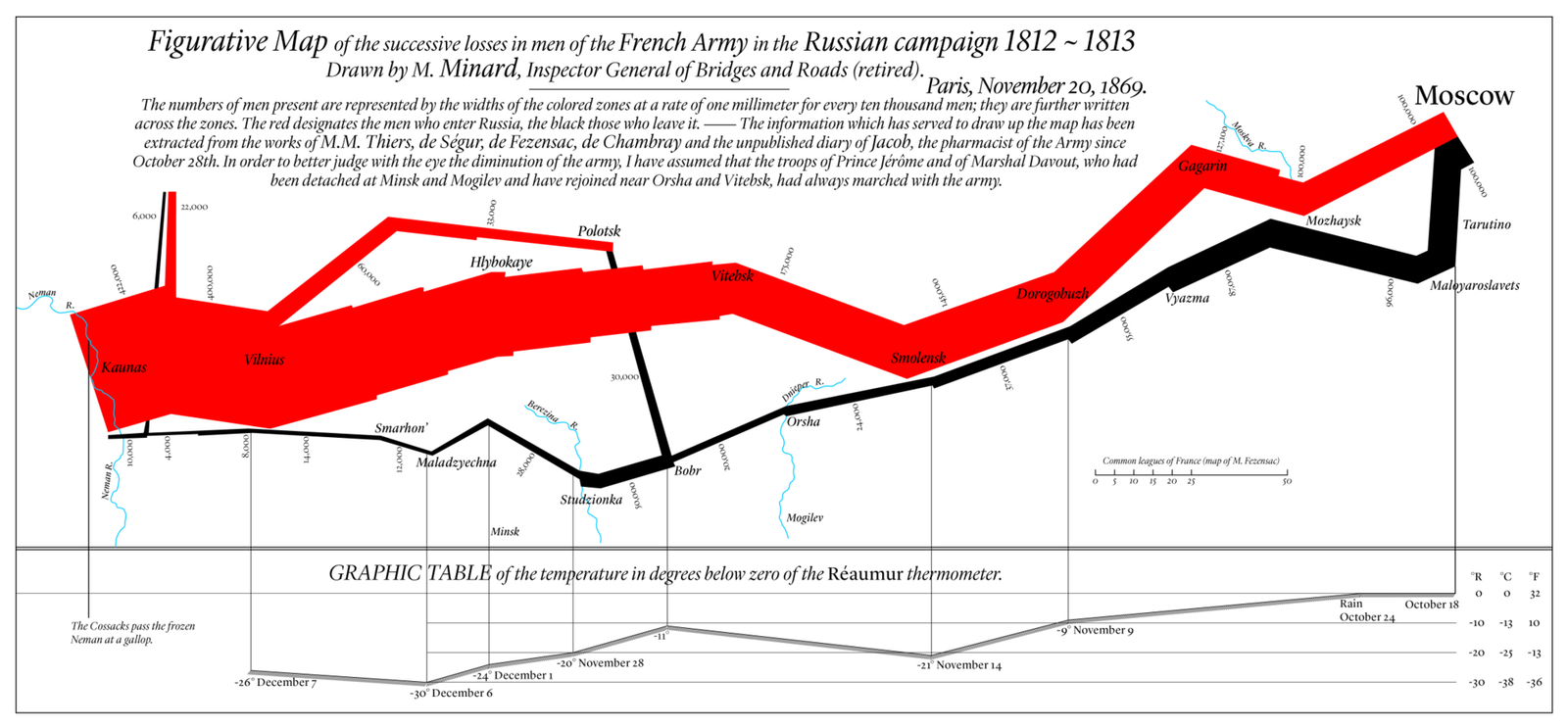
On the 20th of November 1869, in Paris, Charles Joseph Minard depicted his infographic to illustrate Napoleon’s Russian Campaign and his army losses during the invasion and then the retreating, in 1812 and 1813. This infographic, which is also termed as Napoleon’s March or The Minard’s Graphic, demonstrates the statistical and quantitative information visualizations of this campaign [1].
Napoleon’s March was drawn as a two-dimensional infographic with five types of information:
- the number of Napoleon’s army troops (started with 422,000 and ended with 10,000),
- the marching distance (Map Scale),
- the temperature degrees (in Réaumur scale),
- the direction of the campaign (invasion in red/brown color and retreating in black color), and
- the specific locations and dates during the retreating.
Note that,
- the lines of invasion and retreating represent the troops’ size, direction, and routes in space and time, and
- one millimeter of these lines, as a thickness, equals to 10,000 troops.
Due to its importance, a modern redrawing of Charles Joseph Minard’s infographic translated into English with temperature degrees conversion (in Réaumur, Fahrenheit, and Celsius), as shown in Figure 1.
Figure 1. Translated Version of Charles Joseph Minard’s Infographic [2].
P.S. The infographic of Napoleon’s March obtained from [3].
References:
[1] B. Mason. “The Underappreciated Man Behind the Best Graphic Ever Produced.” National Geographic. https://www.nationalgeographic.com/news/2017/03/charles-minard-cartography-infographics-history (accessed Sep. 13, 2020).
[2] “Charles Joseph Minard.” Wikipedia. https://en.wikipedia.org/wiki/Charles_Joseph_Minard (accessed Sep. 14, 2020).
[3] J. Corbett. “Charles Joseph Minard: Mapping Napoleon’s March 1869.” Center for Spatially Integrated Social Science. Archived from the original on 12 March 2017 (retrieved Sep. 21, 2014).
